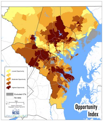
Opportunity mapping—the geographic distribution of social and economic opportunities and shortfalls—can help stakeholders visualize assets and disparities within a community, from access to transportation to the quality of schools. But while opportunity maps can be the impetus for public conversation and a powerful tool for advocacy, they are just one part of a complex equation for creating meaningful change. A new paper published this month in the Journal of Planning Education and Research indicates that opportunity maps have the potential to help shape equitable policy across a region, but only when paired with community engagement and buy-in, grassroots advocacy and, most importantly, political will.
“Data doesn’t solve problems, it just illuminates them,” said Nicholas Finio, one of the paper’s authors and the associate director of the National Center for Smart Growth. “It’s really this question of, what do you do with it? We wanted to explore how regions were approaching this, how they were using opportunity maps and whether it was helpful in the policy process.”
 The paper, co-authored by Finio, Associate Professor of Urban Planning Willow Lung-Amam, Professor of Urban Planning Gerrit Knaap, Associate Professor of Urban Planning Casey Dawkins and PhD student Brittany Wong examined case studies from five metropolitan areas that have employed equity and opportunity mapping in regional planning—Atlanta, Denver, Minneapolis-St. Paul, Portland and Seattle. In each instance, stakeholders faced a unique set of challenges and priorities—from large immigrant communities to strong, expensive housing markets—but also benefited from a strong network of NGOs, community-based and regional stakeholders.
The case studies demonstrated that opportunity maps were effective tools for stakeholders in visualizing data surrounding regional opportunities and challenges. In particular, maps shed light on development trends and challenges facing disadvantaged communities. But the potential of opportunity maps, the study suggests, contends with a number of factors that influence how effective and meaningful maps are in creating equitable metropolitan regions.
Who participates in the creation of opportunity maps is a critical factor. The study suggests that opportunity maps can be particularly useful for grassroots organizations to incite modest, community-driven efforts; in Portland, opportunity maps correlated traffic conditions with rates of asthma to argue for reduced traffic. Direct, ongoing engagement with local stakeholders and residents gives communities greater agency in defining what opportunity looks like and for revealing community assets. When used incorrectly, however, maps can actually do more harm than good; without clear goals and sustained conversations, maps can actually hinder existing community efforts and paint an inaccurate picture of the challenges they face.
“When mapping efforts come from grassroots initiatives they have an automatic tie in and an audience that will push policymakers,” says Lung-Amam. “Data itself is not a change-making agent; it has to be grounded in the concerns of the community. We need to challenge what opportunity looks like and how it’s measured.”
Limitations of mapping technologies, such as regular maintenance and data quality, can influence a map’s accuracy; too much data, on the other hand, can stymy efforts and result in “indicator fatigue.” And while opportunity maps can fill critical capacity gaps in data collection and visualization efforts, the lack of government investment in the process has historically been a major obstacle in leveraging maps to develop planning policy. The creation of opportunity and equity maps, the study points out, is often driven by nonprofits, community organizations or NGOs. Institutionalizing the process, the researchers suggest, is critical to realizing their full potential.
“These tools can be really powerful if they have the right funding and support behind them,” says Finio. “Opportunity maps and atlases are effective ways to show disparities in a variety of metrics, to start a conversation, or as a tool for advocacy. But in order for these maps to shape policy, they need more investment and involvement of local and regional governments.”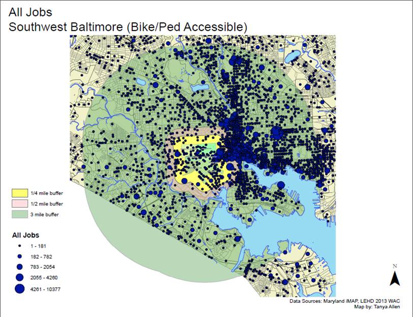
The paper stemmed from a previous study of opportunity mapping in Baltimore for Enterprise Community Partners in 2018. The National Center for Smart Growth and faculty of UMD’s Urban Studies and Planning Program have helped communities around the region develop opportunity maps to advocate for more sustainable, equitable communities.
Finio sees some of the lessons learned from the study being applied to the Purple Line light rail, one of the largest regional transit investments so far this century. NCSG maintains the data and dashboard of the two-county region that will be home to the Purple Line as part of the Center’s work with the Purple Line Corridor Coalition. Metrics created by NCSG researchers demonstrate differences in access to transportation, housing quality and the health of small businesses, which could paint a vivid picture of the corridor communities’ challenges and strengths, particularly those that are most vulnerable.
“The barriers today in regional planning are huge,” says Lung-Amam. “Data can be the spark for change, but communities have to be a part of what that change looks like.”
Read the full study at the journal website.