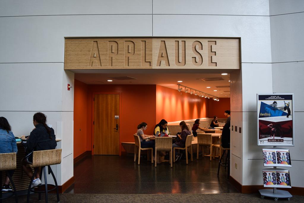
Update: Two years ago, the ARCH406 studio started the redesign of Applause Café in The Clarice Smith Performing Arts Center. This month, the crew completed the installation of furnishings in the seating areas. Click HERE to view images of the new installation and students enjoying it!
This spring, The Clarice Smith Performing Arts Center (The Clarice) at UMD will unveil a new production very different from the artists regularly showcased on stage. The newly refurbished Applause Café will offer an upscale dining experience for students and faculty, borrowing themes from California cafés and featuring a revamped menu. Yet, like many productions at The Clarice, the setting plays a large role in the narrative: taking center stage will be a whimsical café design developed by students from Associate Professor of Architecture Madlen Simon’s graduate-level design studio, ARCH 406.
The studio concept, which was a collaboration between The Clarice, Dining Services, Facilities Management and the Architecture Program, emerged when The Clarice administration began reexamining the space as part of a plan to replace the center’s flooring this winter. While The Clarice is the premiere venue for arts and entertainment on campus, that creative spirit was not reflected in its café. The current café stands as a blank canvas; seating and serving areas are sliced down the middle by a kitchen, making two disjointed spaces. The eating area, comprised of loose tables and chairs, is mired by “improvised” seating configurations—sometimes with chairs migrating into the hallway or disappearing all together—making the café seem more like a student lounge. In the interest of offering guests an artistically holistic experience, the studio project was set into motion, creating a re-conceptualized, engaging destination for students, faculty and performance guests.
Unifying these spaces and creating a sense of permanence was a top priority. But the project came with one critical restraint: the students did not have license to knock down or move any walls. That meant creating the client’s desired connectivity through flooring, lighting and furniture design.
Using garden cafés as inspiration, the students conceived an impressionistic sidewalk café, mimicking planting beds and trees with carpet and structures to unify the café and bring a sense of the outdoors in. An amoeba-like curve in the carpet echoes the flowing curve of the countertop and seating, organizing the disparate spaces of the serving area, the main eating area and hallway. A permanent eating area replaces the current, haphazard seating configuration in the back, with more flexible seating in the front, solidifying the café’s presence in the center and creating a sense of place. This physical manipulation of the environment creates the visual cues that offer a sense of arrival, and foster a sense of connection and flow.
Because of the limitations presented by the building, furniture design took center stage in achieving the design vision. In a discipline that typically focuses on the conceptual, actual construction was an unconventional and educational experience. The students worked with The Clarice’s technical staff in the prop shop for two weeks developing prototypes for the chairs, tables and a long curving bench and countertop intended to flow from the serving to the seating space. Creating detailed digital drawings for each piece and learning the technical aspects—such as the use of biscuit joints—was unfamiliar territory for most. With each iteration, the team found elements in their drawings that needed adjusting. It was an interesting exercise for students who don’t typically build what they design, and offered new insight into how they draw.
“It’s one thing to mock up a chair this size and think that it looks good, its quite another to mock it up life-size and actually sit in it and think, ‘the back feels weird’ or ‘it’s not deep enough’,” said Mike Gessner, an architecture graduate student on the design team.
Another important objective was the concept of food as performance; stakeholders were interested in making the dining experience as much of a sensory adventure as the performances themselves. While the curving forms and ribbed surfaces played a large part in that achieving that goal, lighting played an equally important role, exposing the students to the ways light can create and shape space. Working with The Clarice’s theatrical lighting designer, students developed an engaging lighting scheme for the café. Backlit signage offers a riff on performers onstage, casting a dramatic shadow onto the café’s entry.
The team will provide completed drawings and prototypes in time for construction, which commences this month in. The project will unfold in phases, with the new serving area scheduled to have a soft opening just after spring break.
“When the performing arts center was built, food and drink wasn’t thought of as primary to the experience,” explains Simon. “It just wasn’t conceived of as part of the mission of the center. Now, with changing times, they are really into the idea that food and drink is performance, just like music, dance and theatre. The Applause Café, which was once nothing that you would give a second look, suddenly assumed a greater importance to the people running the center. I think that the work of this class makes this a visually active and exciting space, and feeds into their desire to consider Applause Café part of the performance experience at The Clarice.”

